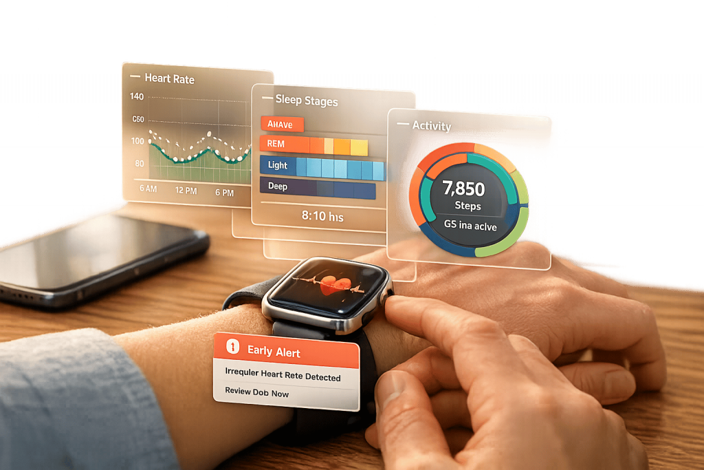
Interactive health data visualization transforms raw sensor data into dynamic, user-friendly visuals that help you better understand your health. Unlike static charts, these tools allow you to interact with your data – filtering, zooming, and exploring trends. This approach is especially useful for wearable devices like AIH LLC‘s aiSpine and aiRing, which track posture and vital signs, respectively. Here’s why this matters:
- Simplifies complex data: Visuals like line graphs and heatmaps make it easier to spot patterns and anomalies.
- Improves decision-making: Real-time feedback and trend analysis help you act on your health data effectively.
- Boosts engagement: Features like progress bars and dashboards motivate you to stay consistent with health goals.
- Supports early detection: Continuous monitoring can identify health risks before they escalate.
The AIH Health App integrates data from these devices, presenting it in clear, actionable formats like Health Score Timelines and Risk Assessment Matrices. This empowers you to make informed choices and manage your health more effectively. Whether you’re tracking posture, monitoring heart rate, or managing chronic conditions, interactive visualizations provide the insights you need for better health outcomes.
Interactive Health Data Visualization Benefits and Impact Statistics
Core Principles of Effective Health Data Visualizations
User-Centered Design
Designing with the end-user in mind is the cornerstone of creating impactful health data visualizations. Glanceability is key. Users should be able to grasp critical metrics within seconds, which means eliminating unnecessary clutter and focusing on essential functionalities.
Accessibility is equally important. Thoughtful designs cater to diverse users, including older adults and individuals with visual, auditory, or motor impairments. Features like adjustable text sizes, high-contrast color schemes, and compatibility with assistive technologies (e.g., hearing aids) ensure that health data is accessible to all. Professor Dan Rosenberg from San Jose State University underscores this point:
"If you blow the UX design, it doesn’t matter how good the AI is."
Visual quality directly impacts trust. A poorly designed interface can make users question the accuracy of their medical data.
Another crucial aspect is adapting visualizations to the user’s context. For instance, a wearable device should prioritize navigation metrics while walking or highlight heart rate during workouts. This layered approach – offering essential information upfront while allowing users to dive deeper through simple swipes or taps – keeps interfaces clean without sacrificing functionality.
Once user-centered design is in place, the next step is simplifying complex data for better understanding.
Simplifying Complex Data
Raw data alone isn’t helpful – it needs to be transformed into actionable insights to support informed health decisions. Start by reducing cognitive load: limit each visualization to a single main idea to avoid overwhelming users.
Stick to familiar visualization formats. For example:
- Line charts are ideal for showing trends over time, like monitoring heart rate throughout the day.
- Bar charts work well for comparing categories, such as weekly activity levels.
Using these common formats helps users with varying levels of data literacy interpret their health information more easily. Additionally, always pair visuals with clear summaries. Users shouldn’t have to guess the takeaway from their data.
With simplified data, the next focus is creating a clear visual hierarchy to guide interpretation.
Visual Hierarchy and Color Theory
Visual hierarchy relies on attributes like size, color, shape, and position, which are processed almost instantly by the brain. This preattentive processing makes it vital to structure health visualizations carefully. For quantitative data, position and length are the most precise visual tools. For example, bar charts or scatterplots are more effective for vital signs than relying solely on color intensity or line width.
Color plays a powerful role in conveying meaning. Use it thoughtfully:
- Sequential schemes (light to dark) for increasing values, like exercise intensity.
- Diverging schemes for deviations from healthy baselines.
- Qualitative schemes for distinguishing categories.
Always design with accessibility in mind. Use colorblind-safe palettes and ensure visuals remain clear in grayscale.
The data-ink ratio principle is another key guideline: remove any non-essential visual elements to keep the focus on the data itself. Every line, color, and shape should have a purpose. For instance, taller or longer elements naturally signify higher values, while darker colors suggest greater intensity. Leveraging these intuitive associations ensures users can interpret their health data effortlessly.
Visualization Techniques in Health Monitoring Apps
Interactive Dashboards and Progress Bars
Interactive dashboards bring together health metrics like heart rate, activity levels, and blood pressure onto one screen, making it easier to identify patterns without jumping between multiple views. This is especially helpful for users managing chronic conditions, as they often need to track several metrics at once. Customizable layouts allow key metrics to take center stage.
Progress bars, on the other hand, provide a simple and intuitive way to track daily goals – whether it’s step counts or calories burned. They let you quickly see how far you’ve come without needing to interpret complex data. Research highlights that visual displays improve cognitive efficiency, particularly on smaller smartwatch screens. For example, bar charts excel at presenting exercise intensity and heart rate zones because they are easy to interpret quickly, whereas radial charts can slow down information processing. Additionally, dark mode is a user favorite for health monitoring apps, consistently receiving higher ratings for interface usability. These dashboard tools naturally lead into other visualization methods that deepen user engagement with their health data.
Time-Series Graphs and Trend Analysis
Time-series graphs offer a broader view of how health metrics evolve over time, showing changes across days, weeks, or months. They provide a continuous narrative, helping users identify trends and establish a personal baseline from otherwise isolated data points.
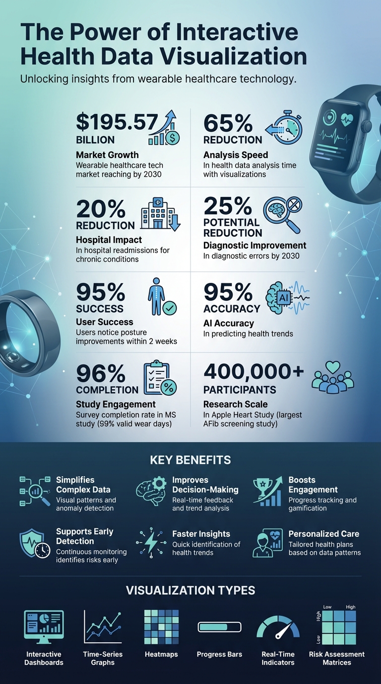
A prime example of trend analysis in action is the Apple Heart Study conducted between 2017 and 2019. With over 400,000 participants using irregular rhythm notifications from Apple Watch, it became the largest screening study for atrial fibrillation ever conducted. Another study focused on individuals with Multiple Sclerosis found that combining wearable sensor data with weekly feedback resulted in a 96% survey completion rate and 99% valid wear days. This underscores how effective trend visualization keeps users engaged and invested in their health.
Heatmaps and Real-Time Indicators
Heatmaps use color-coded visuals to highlight patterns in data like sleep stages, posture habits, or daily activity intensity. For instance, a red patch in an otherwise green heatmap can instantly signal an anomaly that needs attention.
Real-time indicators take this a step further by providing live alerts for critical changes in health metrics, such as blood pressure spikes, irregular heart rhythms, or sudden temperature fluctuations. These alerts allow for immediate action when something is off. A notable example is the Cancer Wellness Program (CWP) app developed in 2025 in Vietnam. This app synchronized with Fitbit Charge 5 devices and displayed patient data – like heart rate, SpO₂, and sleep stages – on a clinician dashboard. The clear graphical layout allowed healthcare providers to monitor symptoms and deliver tailored health education to women with cancer. In a study involving 15 healthcare professionals, the app’s visualizations significantly enhanced the ability to identify patient health trends.
Health data visualisation with Tableau
AIH LLC Devices and Their Interactive Visualizations
AIH LLC devices use interactive visualizations to simplify complex sensor data, turning it into actionable health insights.
aiSpine: Posture Monitoring Visualizations
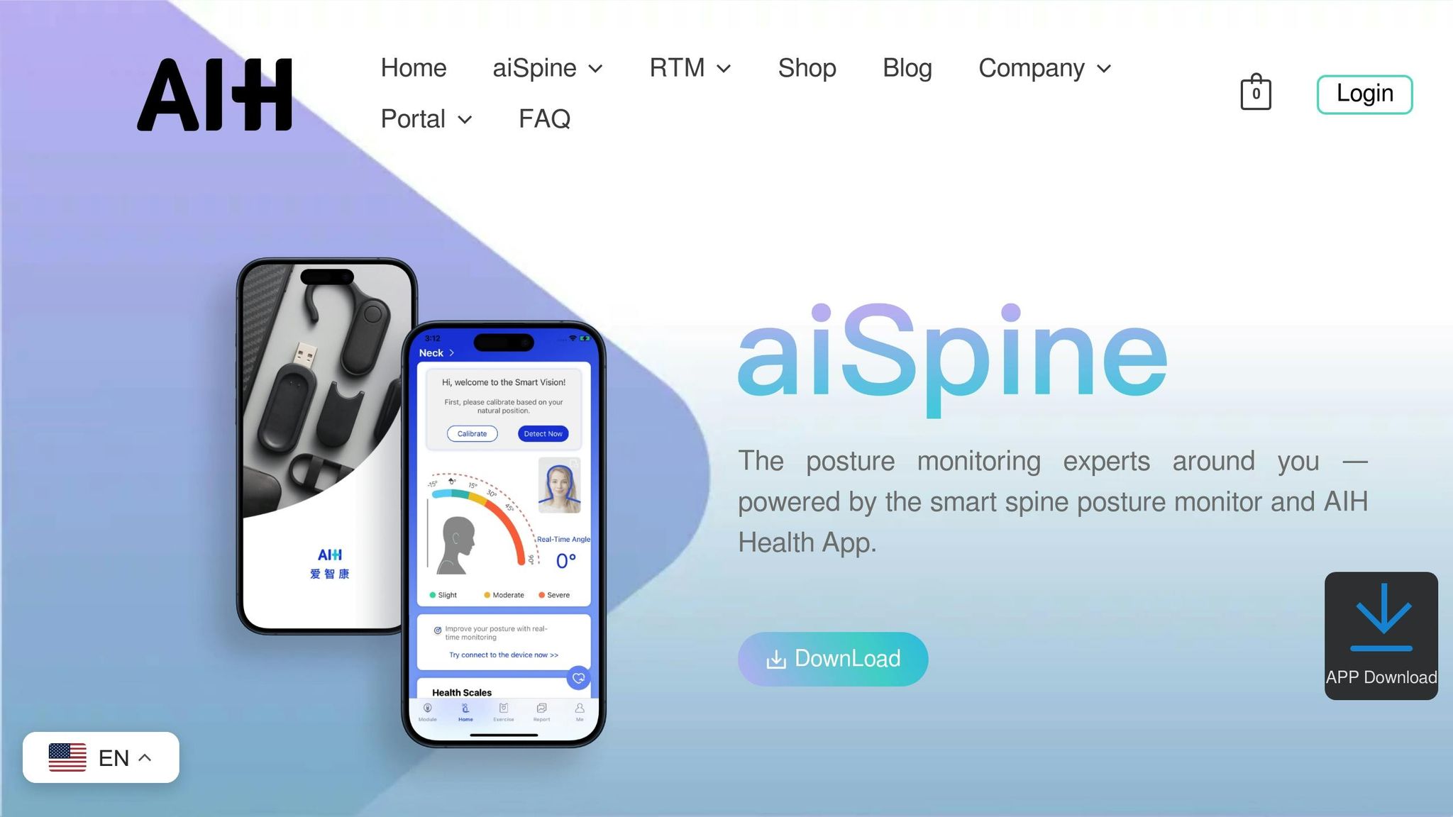
The aiSpine device is designed to help you maintain better posture throughout the day. Equipped with high-precision sensors, it tracks your spine alignment and sends a gentle vibration when it detects slouching. This real-time feedback helps train your muscle memory, reducing the need for external supports over time.
Through its companion app, the device transforms raw sensor data into easy-to-follow training plans and detailed progress reports. You can monitor how often you slouch, track improvements in your alignment, and see how your muscle memory develops. Clinical research highlights that 95% of users notice posture improvements within just two weeks of using this smart training approach. A physiotherapist has also endorsed the effectiveness of this biofeedback method.
Now, let’s take a look at how aiRing enhances vital sign tracking.
aiRing: Vital Signs Tracking and Insights
The aiRing is designed to keep tabs on your vital signs, including heart rate, SpO₂, heart rate variability (HRV), sleep quality, and stress levels. Using optical PPG sensors, it delivers real-time alerts whenever it detects significant changes in these metrics, enabling quick action when needed.
By analyzing trends over time – days, weeks, or even longer – the aiRing helps identify early warning signs of chronic conditions. This kind of continuous monitoring is especially important since subtle shifts in vital signs can often indicate the onset of chronic illnesses.
Integration with AIH Health App
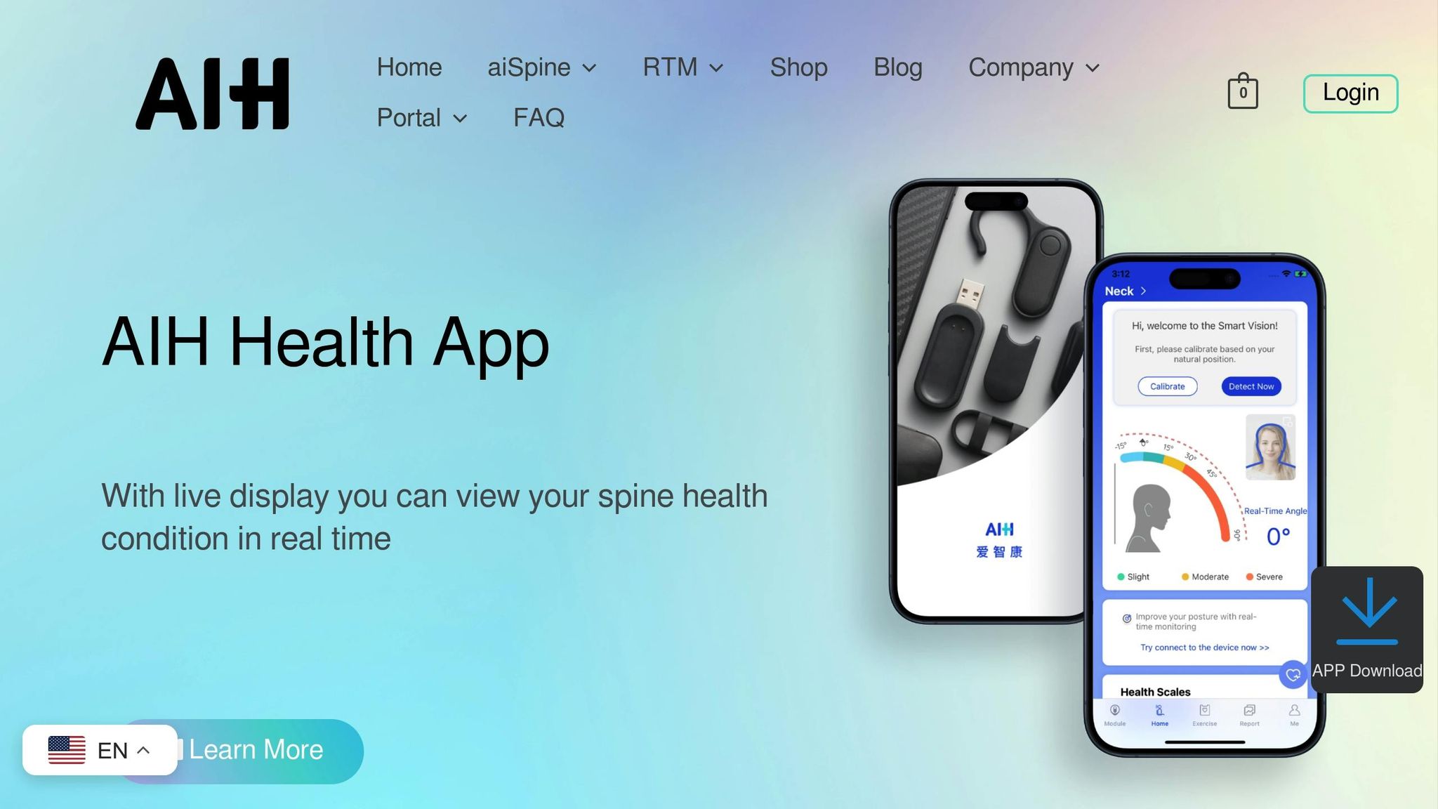
To bring everything together, the AIH Health App acts as a central hub. It syncs data from both aiSpine and aiRing, along with lab results and electronic health records, giving you a complete view of your health in one place.
The app uses machine learning to uncover patterns and relationships between various health metrics, achieving an impressive 95% accuracy in predicting health trends. It presents this data in user-friendly formats like Health Score Timelines, Risk Assessment Matrices, and Correlation Networks. These tools not only help you understand your current health but also give you a clearer picture of where things might be headed.
sbb-itb-44aa802
Best Practices for Interactive Health Data Visualization Design
Accessibility and Personalization
Refining how health data is visualized can make a big difference in how effectively it informs decisions. To keep things simple for users, focus each visualization on one main idea and limit the number of concepts displayed to two or three at most. This minimizes cognitive overload, helping users process information more easily.
Visual elements should go beyond just color to distinguish data. For instance, using dash styles or unique shapes ensures accessibility for users with color blindness or low vision. For older adults, adjustable text sizes and high-contrast colors can address common age-related vision challenges. Additionally, make visualizations compatible with screen readers by including semantic headings and accessible data tables. Avoid relying on mouse hovers to display critical information, as this can exclude mobile users or those who cannot use a mouse.
These thoughtful design choices help create user-friendly visualizations that work well across various devices.
Energy Efficiency and Device Compatibility
For wearable devices, power efficiency is a top priority. Static presentations are a smart choice, as they reduce screen "on-time" and conserve energy, particularly during movement. Another tip? Use dark mode – it can significantly extend battery life on devices with OLED screens.
To ensure smooth operation across different wearables, stick to standardized data formats like Fast Healthcare Interoperability Resources (FHIR) and controlled vocabularies such as SNOMED CT. This ensures seamless data exchange between devices and health systems. Keep an eye on data transmission frequency: too frequent drains batteries, while too infrequent might delay critical alerts.
Once energy efficiency and compatibility are in place, machine learning can take things to the next level.
Machine Learning for Anomaly Detection
Smart algorithms can transform how users interact with health data by identifying important patterns that might otherwise go unnoticed. For example, the AIH Health App uses machine learning to detect anomalies in posture and vital signs, helping to catch subtle changes that could indicate the early stages of chronic conditions.
To build trust, AI-driven alerts should come with clear explanations for flagged anomalies. This transparency reassures users and helps them understand the system’s decisions. To avoid accidental actions, consider features like double-confirmation or long-press gestures for critical health alerts. The aim is to provide actionable insights without overwhelming users with unnecessary notifications.
Benefits of Interactive Visualizations for Health Management
Faster Insights and Better Decision-Making
Wearable devices churn out an overwhelming amount of health data. Interactive visualizations simplify this by transforming raw numbers into easy-to-understand visuals. Tools like heatmaps and line graphs, with clear color coding, help users quickly spot trends and flag potential health concerns. For instance, visualizing electronic health records can cut analysis time by up to 65%. A practical example is the aiSpine and its AIH Health App, which assist users in identifying triggers for chronic back pain, such as poor posture. These rapid insights not only enhance decision-making but also keep users engaged through interactive features like challenges.
Improved Adherence Through Gamification
Interactive visualizations also play a key role in encouraging users to stick with their health plans. By presenting progress as visual elements like bars or achievement levels, they motivate users to stay on track. Real-time feedback on metrics such as posture or vital signs further reinforces positive actions, helping users build healthier routines.
Early Detection and Personalized Care
Real-time monitoring from devices like aiSpine and aiRing, paired with interactive visuals, can detect subtle health changes that might otherwise go unnoticed. These tools are critical for identifying early warning signs of potential issues. Advanced analytics highlight patterns, enabling both users and clinicians to address problems before they escalate. For example, aiSpine data can reveal recurring triggers like poor posture over time. Sharing these visual insights with healthcare providers allows for the development of tailored care plans. Predictive AI models have already shown promise, reducing hospital readmissions for chronic conditions by 20% and potentially lowering diagnostic errors by 25% by 2030. By combining early detection with personalized care, interactive visualizations are shaping a more proactive approach to health management.
Conclusion
The Future of Health Data Visualization
Healthcare is shifting gears – from treating conditions after they appear to actively monitoring and addressing them before they escalate. Interactive visual tools are becoming more advanced, with Explainable AI (XAI) not just showing what your data means, but also explaining why it matters. This transparency builds trust and helps users make informed decisions.
The wearable healthcare tech market is on track to hit $195.57 billion by 2030. Innovations like smart textiles, brain-computer interfaces, and predictive diagnostics are driving this growth. These technologies can even anticipate health concerns before symptoms arise. By integrating with Electronic Health Records (EHR) through standards like FHIR/HL7, wearable data can seamlessly enter clinical workflows, enabling quicker decisions and more tailored care plans. As Dr. Eric Topol, a cardiologist and author, puts it:
"Wearable devices are revolutionizing the way we think about health and wellness, shifting from reactive to proactive care".
These advancements pave the way for healthcare that’s smarter, faster, and more personalized.
Call to Action: Explore AIH LLC Solutions
Step into the future of health monitoring with AIH LLC. Their devices, aiSpine and aiRing, provide cutting-edge, clinical-grade insights in real time. The aiSpine offers immediate feedback to help correct poor habits, while the aiRing ensures 24/7 tracking of vital signs, establishing your personal baseline and identifying irregularities early.
Both devices connect effortlessly with the AIH Health App, making them ideal for managing chronic conditions, monitoring cardiovascular health, or simply improving daily wellness. Take control of your health journey today. Visit aihnet.com to see how these AI-powered wearables can help you stay ahead of your health.
FAQs
How can interactive visualizations make health data easier to understand?
Interactive visualizations take the complexity out of health data by transforming it into dynamic, easy-to-navigate formats like graphs, charts, and dashboards. These tools reveal patterns, trends, and connections that might go unnoticed in raw data, making it simpler for healthcare professionals and patients to understand the information and make better decisions.
They’re also great for real-time health monitoring, allowing for quicker interventions and more personalized care. By showing health progress visually, these tools engage patients, improve communication with healthcare providers, and encourage better follow-through on treatment plans. In short, they turn overwhelming data into clear, actionable insights, leading to better care and smoother operations.
What are the key benefits of using AIH LLC’s aiSpine and aiRing wearable devices?
AIH LLC’s aiSpine and aiRing devices bring forward new ways to monitor and manage health effectively. The aiSpine focuses on improving spinal alignment by providing real-time feedback on posture. This can help ease discomfort and lower the chances of developing chronic pain linked to poor posture habits.
The aiRing, on the other hand, keeps tabs on key health metrics like heart rate and oxygen levels. It offers an easy and reliable way to stay informed about your overall health. Both devices connect effortlessly with the AIH Health App, allowing for real-time tracking, tailored insights, and remote therapeutic monitoring. Together, they simplify managing chronic conditions and encourage a proactive approach to personal health.
How does the AIH Health App improve health tracking and decision-making?
The AIH Health App streamlines health tracking and decision-making by seamlessly integrating real-time data from wearable devices like the aiSpine posture monitor and aiRing vital signs monitor. These devices gather key health metrics – such as posture and vital signs – and display them in the app using clear, interactive visualizations. This allows both users and healthcare providers to easily spot trends, track progress, and make well-informed decisions.
With features like personalized feedback and remote therapeutic monitoring, the app encourages users to take charge of their health. Its straightforward design simplifies complex health data, turning it into actionable insights that help users stick to treatment plans and enable timely interventions. By blending advanced analytics with an easy-to-navigate interface, the AIH Health App serves as a powerful tool for proactive and effective health management.